
MADISON, Wis. – Nordic’s evolution from an Epic-only staff augmentation consulting firm to one offering end-to-end healthcare solutions is represented in a new logo, which Nordic released today. The new logo features a more modern look. With a cleaner, Scandinavian-inspired design, it captures Nordic’s straightforward approach to helping healthcare organizations.
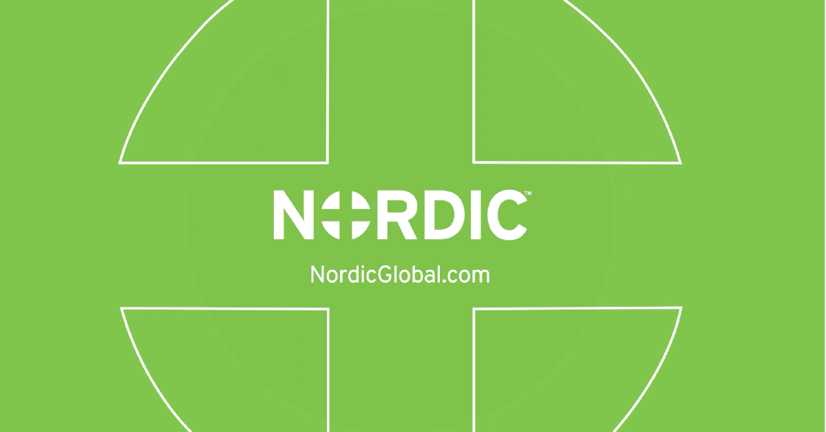
![]() “Our name and our logo reflect our simple desire to make healthcare better for all patients and their families,” Nordic Visual Brand Manager Jenny Dahl said. “We wanted a simple, beautiful, and powerful design to show that. Our old logo incorporated a cross to represent our focus on improving healthcare. In our new design, we bring that healthcare focus into the center of our name.”
“Our name and our logo reflect our simple desire to make healthcare better for all patients and their families,” Nordic Visual Brand Manager Jenny Dahl said. “We wanted a simple, beautiful, and powerful design to show that. Our old logo incorporated a cross to represent our focus on improving healthcare. In our new design, we bring that healthcare focus into the center of our name.”
The four green boxes that created a healthcare cross in the negative space of the old logo have been modified into four rounded triangles to form the “O” in the word Nordic. The four aligned triangles represent four elements that Nordic helps clients align: strategy, people, process, and technology.
Over the years, Nordic has added performance improvement capabilities that impact these four critical areas and cover the revenue cycle, clinical optimization, population health, and support of infrastructure and dashboards clients need for continual data-driven improvement.
“A holistic approach is the key to diagnosing and solving complex issues for healthcare organizations,” Managing Director of Revenue Cycle Transformation Cathy Smith said. “We always uncover better solutions with this broader view. I appreciate the elegance in how our new logo represents this approach.”
While the healthcare landscape has changed in the last nine years, Nordic has grown to become one of the largest independently owned healthcare consulting firms. Nordic has done this with a focus on relationships and quality, enabling clients to deliver improved healthcare for patients and their families.